Pantone Color: Why Color Standardization is Important for Your Brand?
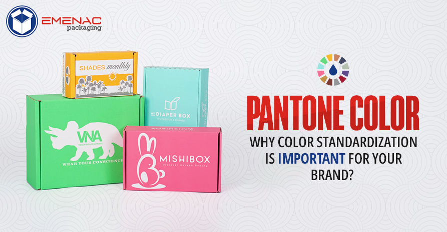
The accurate color tone is a critical factor when it comes to bringing color consistency to your brand logo print and custom packaging design. There is a difference between Light Yellow, Light Goldenrod, Crayola Lemon Yellow, and Yellow. It can easily be identified by using the Pantone Matching System that represents each color by its specific name and code as Light Yellow (FFFFE0), Light Goldenrod (FAFAD2), etc.
For the last 60 years, Pantone has not only simplified color communication for brands and designers but also save the brands from downgrading because of variations in colors. Let’s explore why color standardization is important for your brand's success.
Picks the Right Color for Your Brand
Colors have the capacity to affect the specific emotions of your customers which ultimately leads to making a purchase decision. When you pick the color for your brand, it must resonate with your brand personality, expression, and desires of the target audience. For instance, if your brand claim to create playfulness, happiness, and vitality in your customers, you can use the precise orange color with code from the Pantone book for your packaging design to stimulate the same effect in the customers.
Makes Color Inspection Easy
In the beginning, you create a packaging prototype with the same colors as your desire. However, it will be devastating when the packaging colors changes during the mass production process. By adhering to the Pantone Matching System, it will become easy to recreate the same color and standardize it so that the chances of any change are mitigated altogether.
Reinforces Your Brand Professionalism
When selecting a specific color for your brand, it’s important to keep it consistent on all the platforms including your website, packaging, social media page, etc. The same consistency helps the customers to determine that they are purchasing the original product rather than a copy. Additionally, the consistent colors help to develop the trustworthiness and professionalism of the company in consequence which is more significant for any brand to excel in the market.
Maintains the Visual Integrity of Your Company
Pantone Emergence makes it easy for brands to maintain their visual integrity even if they undergo the rebranding process. For instance, Coca-Cola uses the iconic red color that does not change after passing through a lot of rebranding. The standardization in colors represents the sense of stability and becomes the trademark of the brand.
Use Trendy Colors as Marketing Tool
To set a particular marketing trend, Pantone announces a color of the year annually. In 2023, the color is Viva Magenta 18-1750, you can develop a unique color scheme by employing this color with others present in your packaging. The resulting playful and vibrant hues in your boxes will grab the attention of your customers and provide you with a strong competitive edge in the market.
Conclusion
When you use Pantone Matching System, it helps you to communicate with the packaging manufacturer and supplier to deliver consistent colors in your brand packaging. After standardization, you can also evaluate and inspect the colors which reduces the chances of any variance in colors. It eventually leads to maintaining your brand’s visual integrity by meeting customers’ expectations at large.

Having an ability to customize packaging boxes in different sizes, shapes and styles, Emenac Packaging fulfills the requirement of customers in lowest rate with flawless printed results. Not only we accept short and long run orders, we also use high quality Cardboard, Kraft and Corrugated materials to give you unrivaled printing and packaging solutions.
Share This
 6 Packaging Details That Make Halloween Deliveries Extra Spooky
 Columbus Day 2025 – Culture, Controversy & Commemorations
 How to Safely Ship Candles Without Breakage or Heat Damage?
 Client Appreciation Gifts: A Powerful Retention Strategy
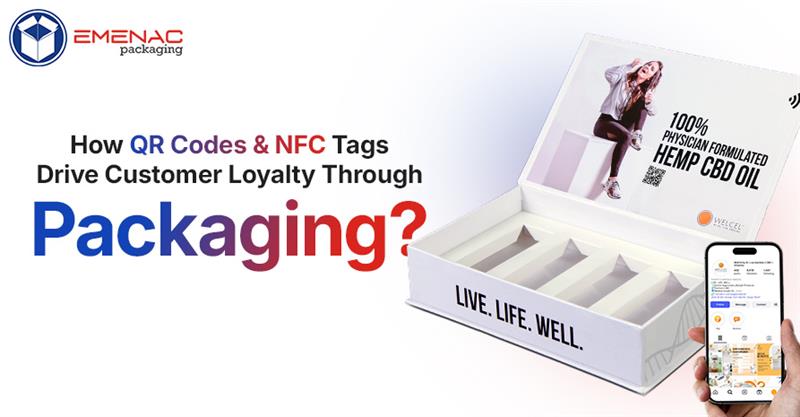 How QR Codes and NFC Tags Drive Customer Loyalty Through Packaging?